Interior design
Layered Neutrals and Textured Grasscloth
The Wallpaper Trend Bringing Warmth to San Diego Homes
Neutral interiors have evolved. Today's most welcoming spaces are not built from a single shade of beige or white; they are carefully layered with tone, texture, and natural materials. One of the most versatile ways to create that depth is through textured grasscloth and softly patterned neutral wallcoverings.
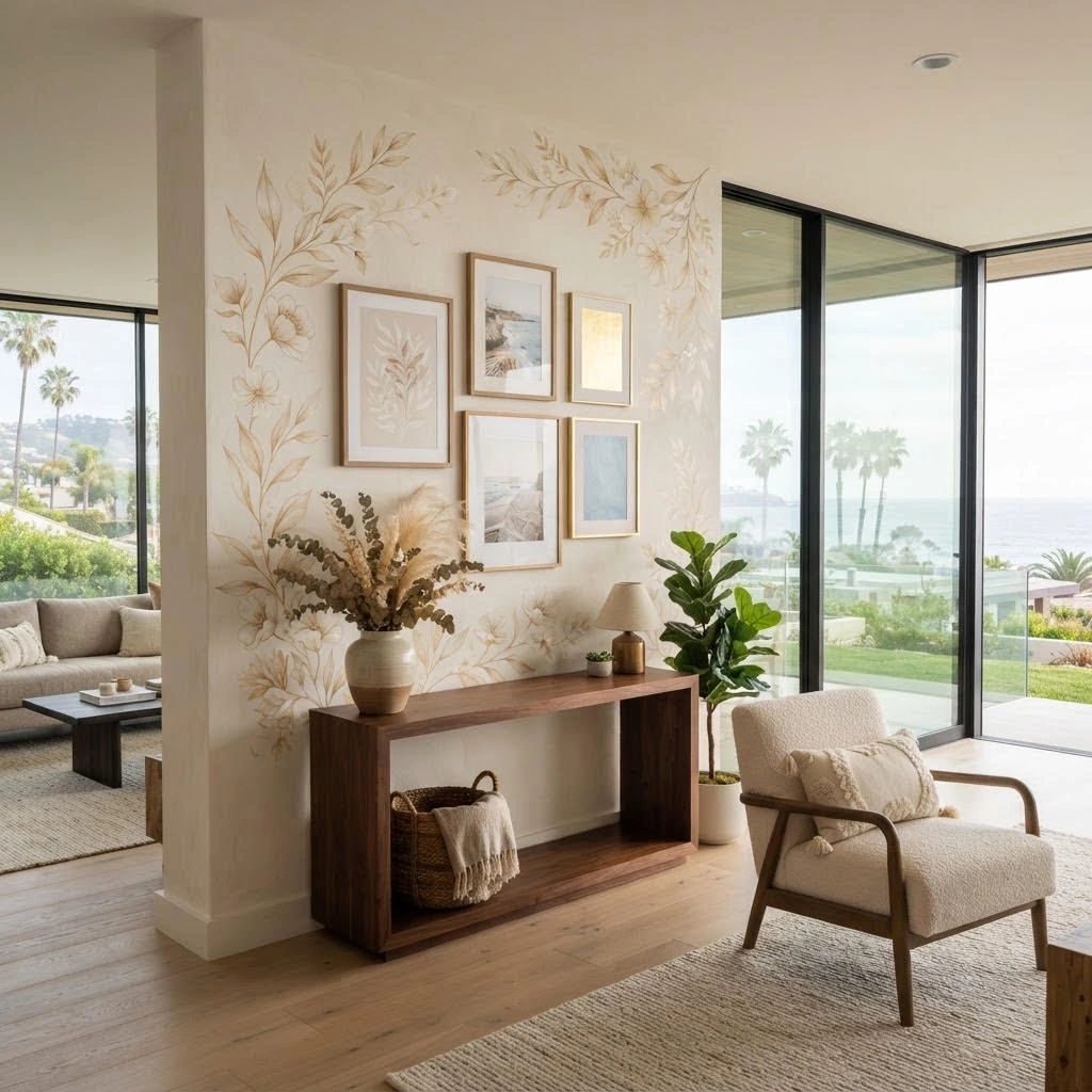
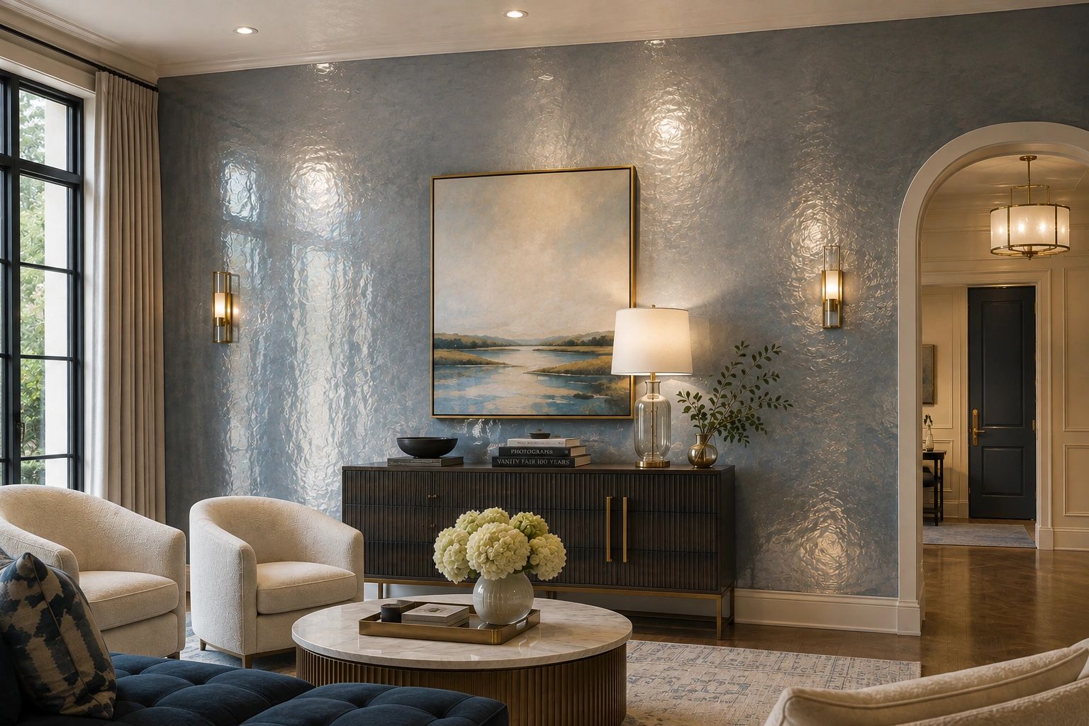
For San Diego homeowners, this approach is especially appealing. Our natural light, relaxed architecture, and connection to the coast create the perfect setting for wallcoverings that feel warm, organic, and refined. At Gael's Wallcoverings, we have helped local families use texture and pattern to make their rooms feel more personal for over 20 years.
Why Layered Neutrals Feel More Interesting
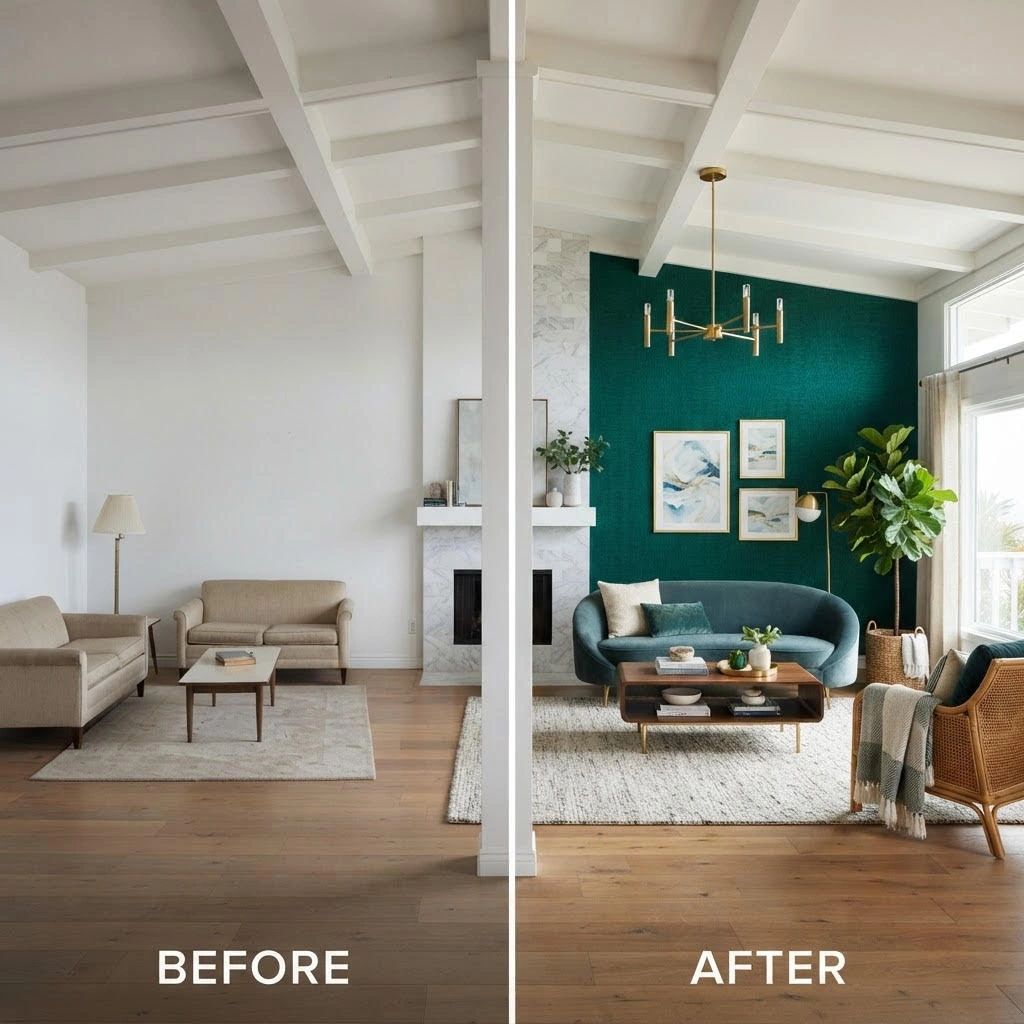
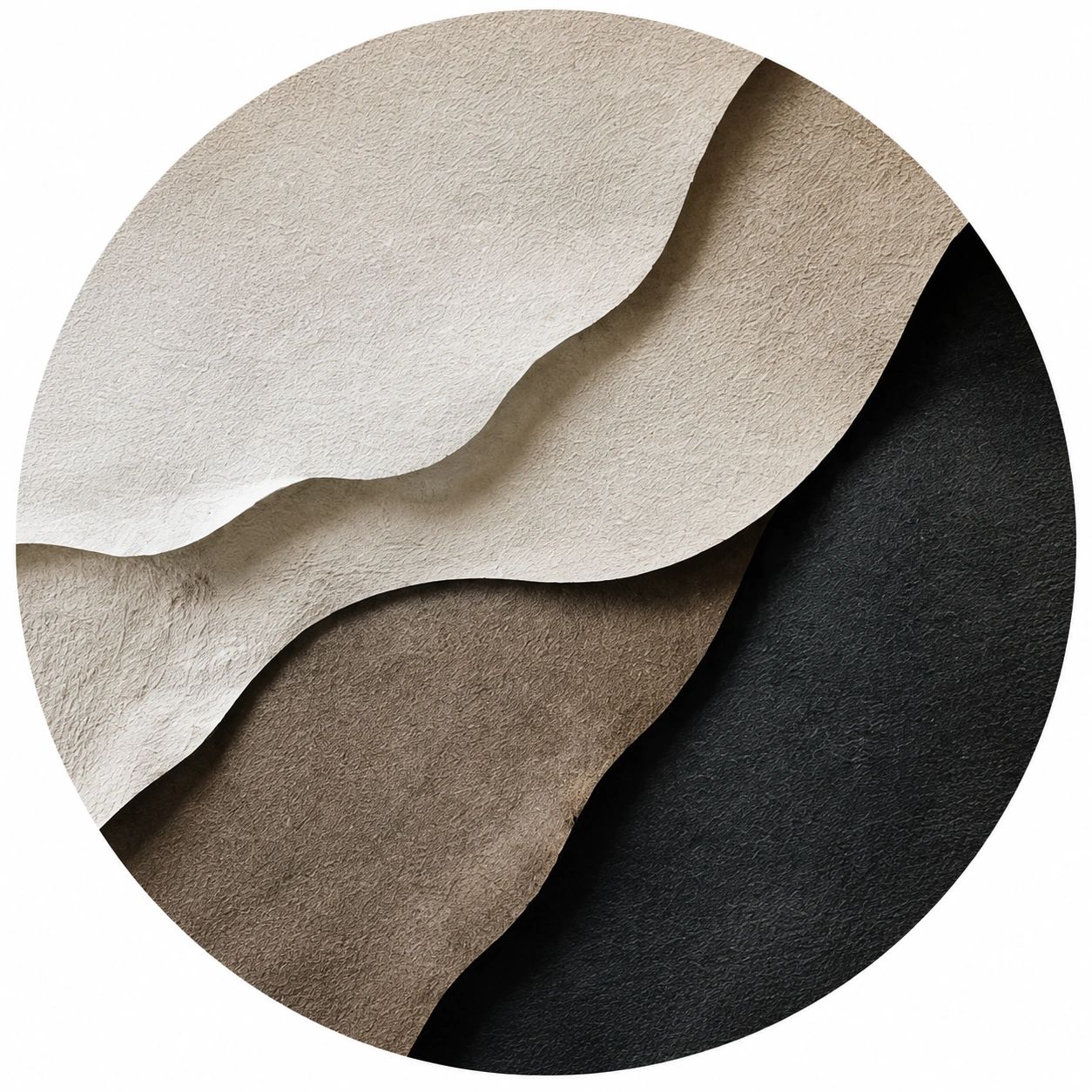
A room decorated in one flat neutral can sometimes feel unfinished. Layered neutrals solve that problem by introducing subtle variation. Warm ivory, sand, mushroom, taupe, and soft gray can work together while maintaining a quiet, cohesive palette.
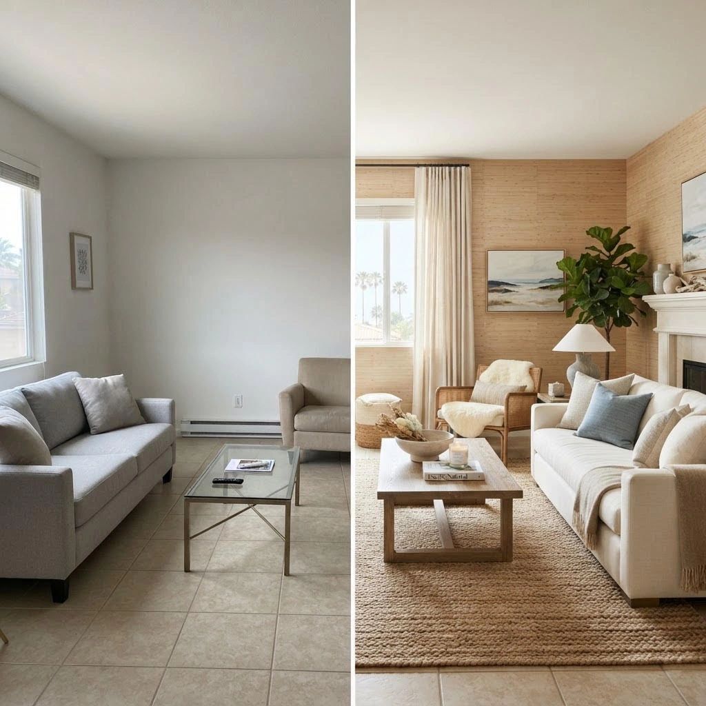
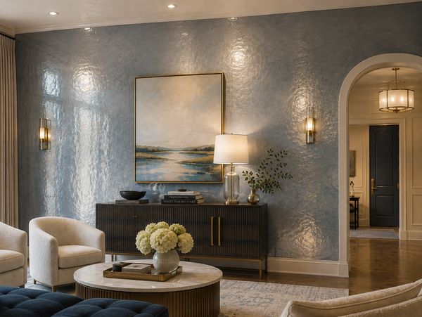
The key is contrast through texture rather than dramatic color. A smooth painted ceiling, a woven wallcovering, a linen sofa, and natural wood furniture each reflect light differently. Those small differences make the room feel dimensional throughout the day.
What Makes Grasscloth Wallcovering Special?
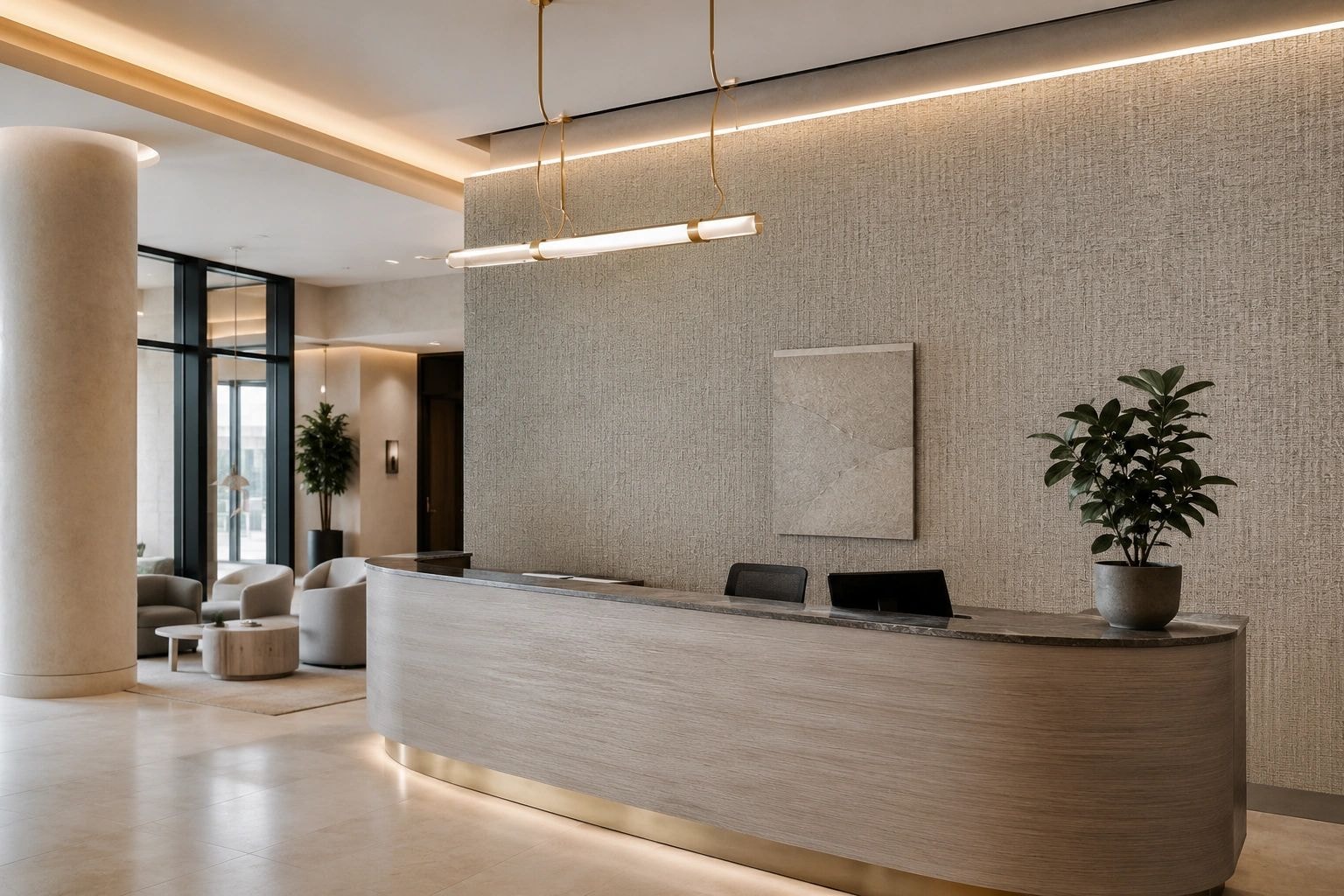
Grasscloth is one of the most requested wallcoverings in San Diego homes, and for good reason. It is made from natural plant fibers — seagrass, jute, sisal, or bamboo — woven together and backed with paper. The result is a wallcovering with genuine organic texture that no printed pattern can replicate.
Each roll of grasscloth is slightly different. The fibers vary in tone and weave, which means your walls will have a natural, handcrafted quality. This is not a flaw — it is the point. Grasscloth brings the kind of warmth and character that makes a room feel lived-in and loved.
How to Layer Neutrals Successfully
Start with your largest surface — the walls — and choose a wallcovering with subtle texture. A warm linen weave or a soft grasscloth in a sand or warm white tone gives you a foundation that works with almost anything.
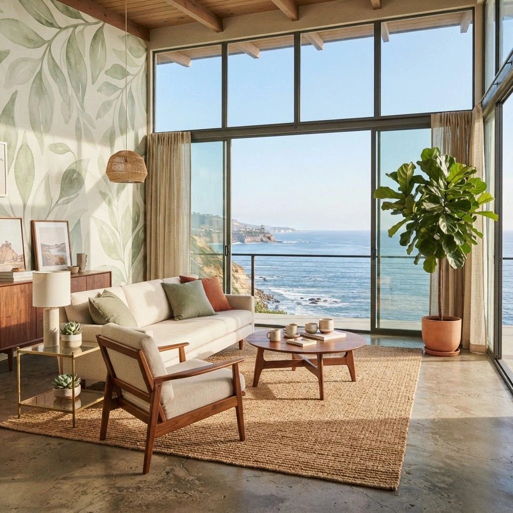
From there, layer in furniture and textiles that introduce slightly different tones and textures. A cream sofa, a natural wood coffee table, a jute rug, and linen curtains all work together because they share the same warm undertone while offering visual variety.
Ready to Explore Textured Wallcoverings?
Visit our San Diego showroom to see and feel our grasscloth and natural fiber collections in person. Our team can help you find the right texture, tone, and pattern for your space. Gael's Wallcoverings — family-owned and operated in San Diego for over 20 years.
Ready to bring these ideas to life? Visit our showroom or get in touch.